

BuyHome.ge
+995 595 33 78 33


Seaside Colors and Textures: How to Avoid a “Tired” Renovation

Seaside Colors and Textures: How to Avoid a “Tired” Renovation
Coastal colors and textures: why seaside renovations age faster 🎨🌊
Seaside apartments face special challenges: salty air, intense light, and higher humidity change how materials look and feel. A renovation that seemed modern at first can quickly feel tired — faded paint, flattened fabrics, and washed‑out surfaces.
What causes the 'tired' look
- Too much stark white or neutral grey that lacks warmth and depth.
- Low-quality materials that show wear and lose texture.
- Unconsidered exposure to direct sun that bleaches colors.
- Lack of tactile contrast — everything feels flat.
Key principles for a fresh coastal interior ✅
- Work with tone, not just color. Choose warm neutrals or muted coastal hues instead of clinical white.
- Use layered textures: pair smooth, easy-to-clean surfaces with soft, tactile textiles.
- Prefer materials that age gracefully — oiled wood, matte stone, and durable fabrics.
- Plan lighting to balance bright daylight with warm, adjustable interior light.
Materials and finishes to prefer 🪵🪨
- Floors: water-resistant engineered wood or porcelain tile with wood or stone look — durable and authentic.
- Walls: washable matte paint or textured plaster rather than glossy finishes.
- Kitchen backsplashes and wet areas: porcelain tile, treated glass, or textured stone.
Tip: use small anchors of natural stone or textured tile to ground a room and avoid monotony.
Textiles and furniture: texture with purpose 🛋️🧵
- Fabrics: medium‑weight linen, woven cotton, or treated performance fabrics that handle cleaning.
- Upholstery: neutral bases with patterned or textured accent cushions; protective treatments extend life.
- Furniture: moisture‑resistant finishes or well‑treated wood. Slight natural wear on wood looks authentic rather than cheap.
Palette examples that work well 🎯
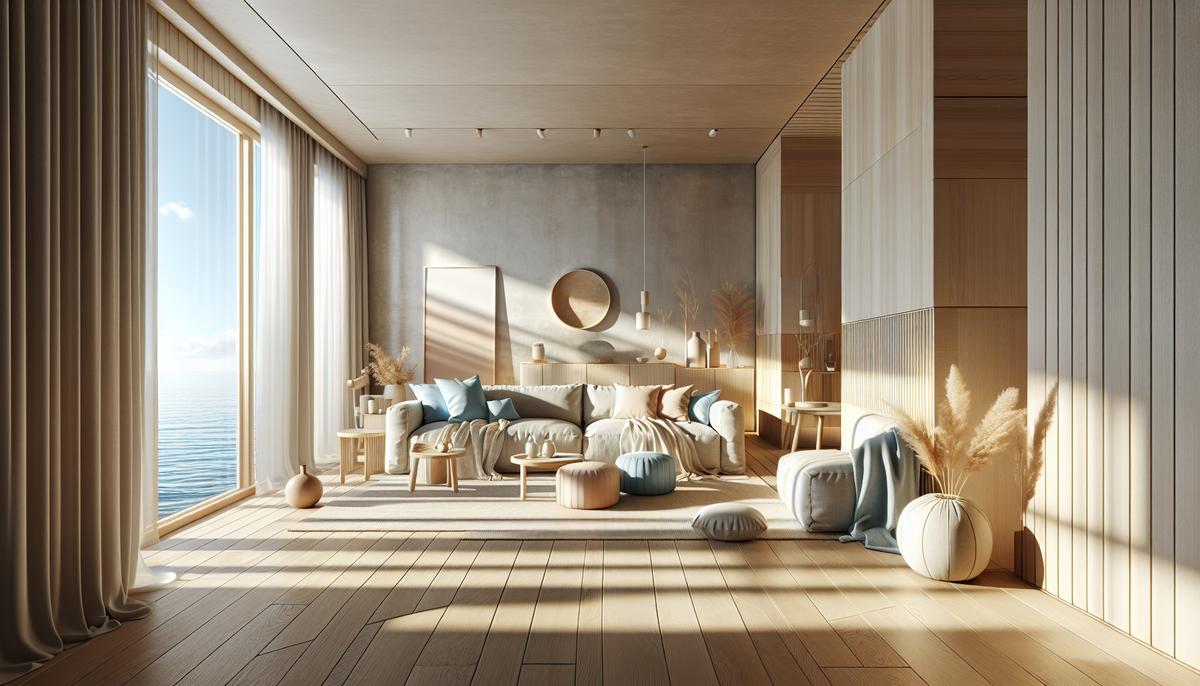
- Sand + sea blue + warm grey — airy and calm.
- Dusty green + light oak + cream — natural and inviting.
- Warm beige + graphite accents + textured white — contrast without harshness.
Practical layout: choose a warm neutral for major walls, a textured rug for grounding, and 2–3 accent pieces in coastal tones.
Lighting and accents ✨
- Multi-layer lighting: ambient ceiling light, task lamps, and accent spots.
- Warm lighting in living spaces; neutral or cooler tones in work areas like the kitchen.
- Accents in matte black, brushed metal or natural stone add character.
Common mistakes to avoid ❌
- All-white schemes without texture — look sterile and age poorly.
- Uniform cheap tile across every space — predictable and quickly outdated.
- Neglecting maintenance: some materials require periodic care to stay attractive.
Practical checklist before renovating ✔️
- Define a palette: 3 base tones and 2 accent colors.
- Specify materials by room and list care instructions.
- Test swatches in both midday sun and evening light.
- Consider wind, sun direction and ventilation in layout decisions.
A note on budgeting and priorities
You don't need the most expensive finishes everywhere. Prioritize visible, high‑use items: entrance flooring, main sofa, and kitchen countertop. Investing in these elements pays off in perceived quality and longevity.
Final thoughts: fresh versus tired 🌟
A fresh coastal interior balances color tone, layered textures, practical materials and thoughtful lighting. That combination prevents the 'tired' look and keeps your seaside home welcoming for years.
If you're looking for a seaside apartment or planning a renovation, we can help select properties and adapt interior concepts to the coastal climate. Browse apartments here: https://buyhome.ge/en/apartments
Contact BuyHome — we'll help you choose and tailor a seaside space that stays fresh and comfortable. 📩
Date added: 20.08.26
Related articles



Related categories

Renovation costs
A practical guide to apartment renovation costs in Georgia—labor and materials, timelines, common pitfalls, and how to control your budget.

Choosing a contractor
How to choose a renovation contractor in Georgia: where to look, what to verify, and how to control quality so you don’t lose time or budget.

Interior
Interior trends in Georgia, layouts, and practical apartment solutions: how to choose a style, plan zones, and create a design that works for living or renting.
Benefits of buying property on BuyHome.ge

Best property prices
No commission for buyers
Up-to-Date Properties on the Website
Free property selection
Free transaction support
Free expert consultations

Submit a Request
for a Consultation!

2026 © All rights reserved